The Project in depth
Brief
Created the branding for a beauty product line that blends nature-inspired elements with a modern look. The goal was to make it feel high-end and luxurious. To do this well, I needed a deep understanding of the brand’s core values and what the target audience finds beautiful.
Audiences & Users
The target group includes people who love skincare and are into unique branding—especially women with strong buying power and active lifestyles. They work, exercise, travel in all kinds of weather, and still want healthy skin and beautiful design in the products they use.
Challenge
I focused on making the brand stand out with a unique shape that could become a strong part of the corporate identity. It had to be eye-catching, consistent across all platforms, and work well on the product packaging itself. Most importantly, it needed to carry that luxury feeling on its own.
I also set the concept that from now on, women shouldn’t have to worry about their skin anymore—MandelBalm will take care of that. All we want is for her to move forward, chasing her dreams and goals. Let MandelBalm handle the skin, so she can focus on everything else.
Directions
I focused on making the brand stand out with a unique shape that could be used as a strong part of the corporate identity. It had to be eye-catching, consistent across all platforms, and able to live on the product packaging itself. Most importantly, it needed to carry that luxury feeling on its own.
Process
Early Stage
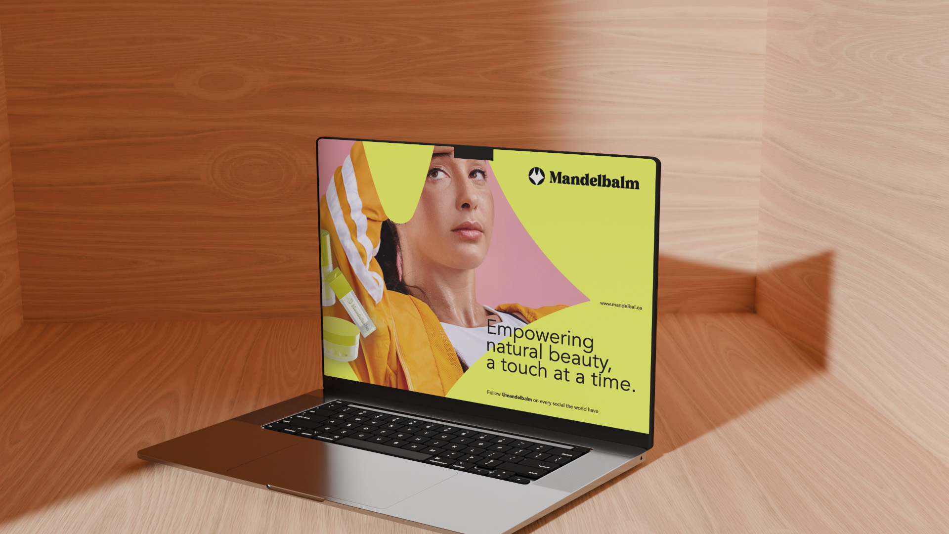
I started with color—something that pops but still feels natural. I chose a bold lemon yellow to show energy and uniqueness. It’s not the soft, feminine tone that many other beauty brands use. This also made the product feel a bit more unisex, which could naturally attract men who also care about skincare.
Middle Stage
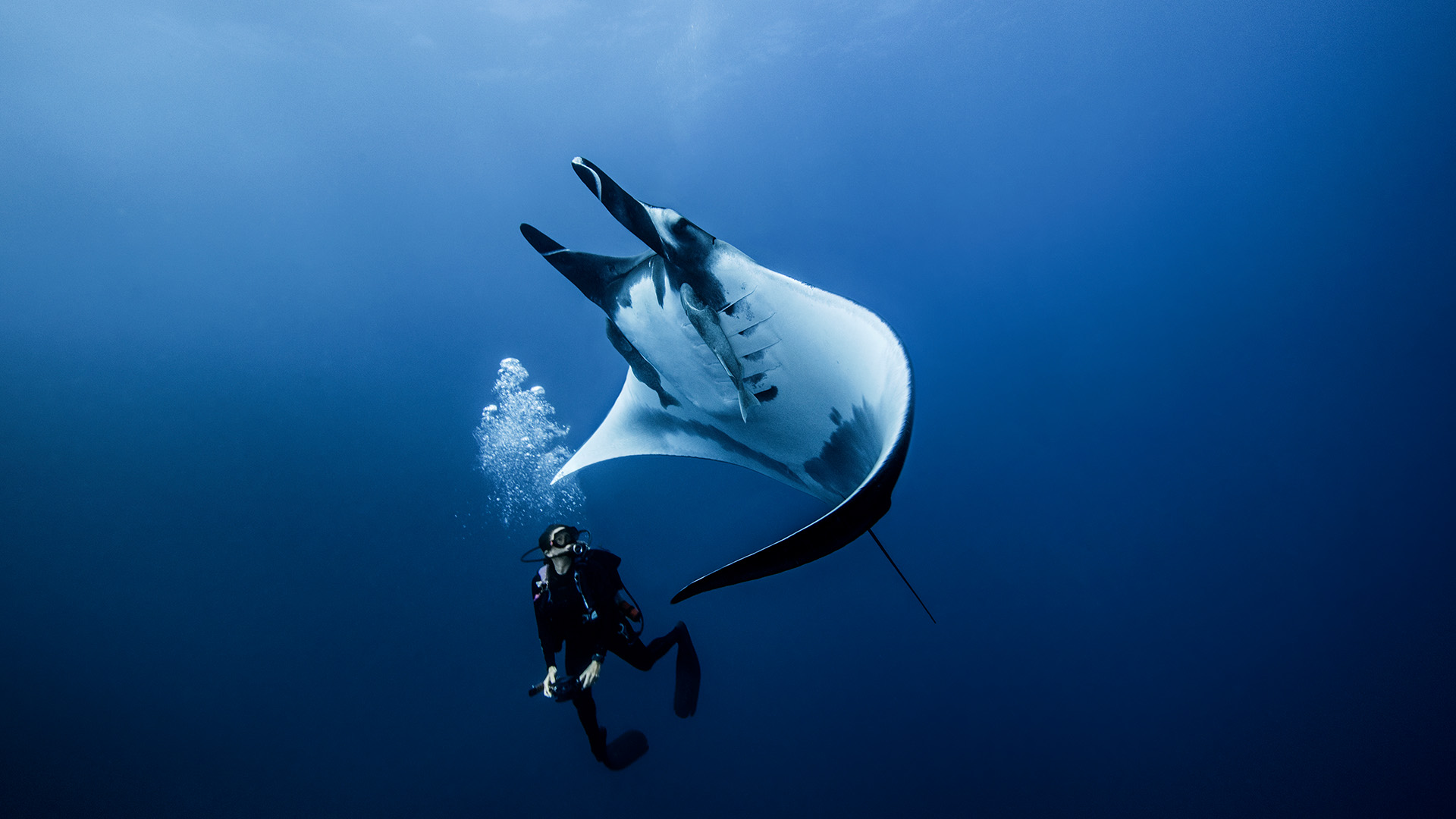
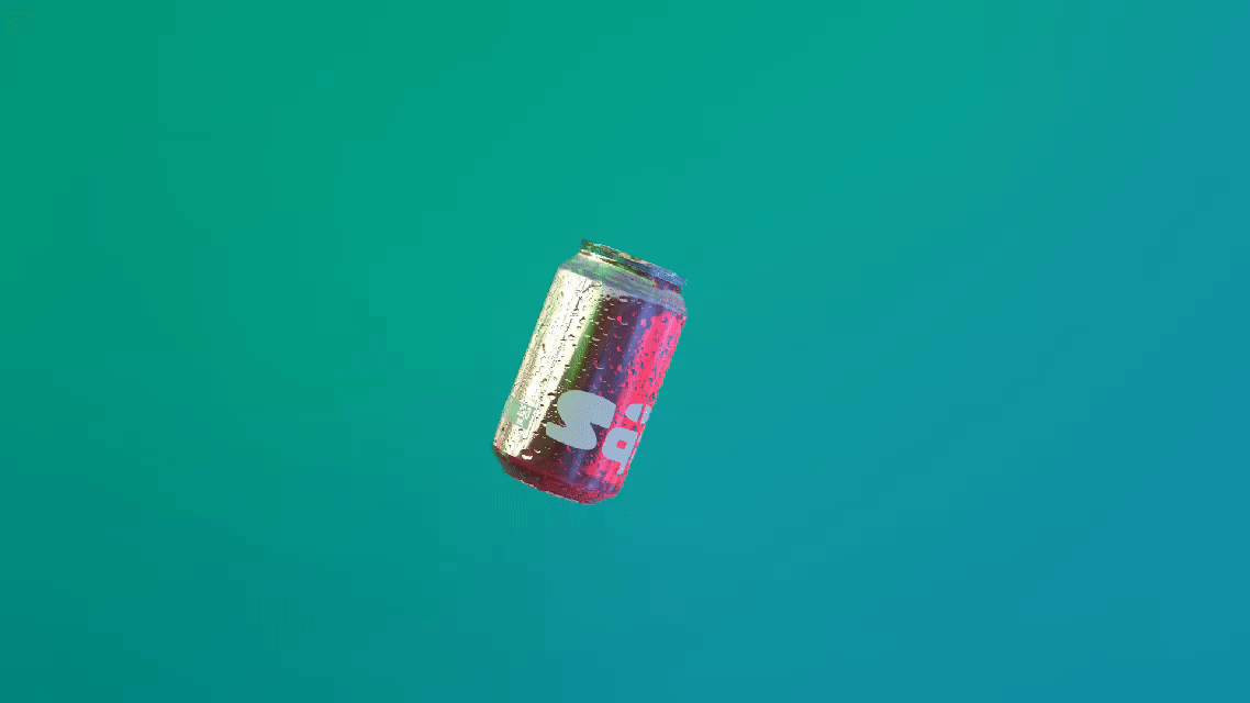
To connect with nature, I created a logo using the letter “M.” From my research, the manta ray stood out as a rare and beautiful creature that symbolizes elegance in nature. I used the manta ray’s head shape and turned it into an abstract “M” for the logo. I kept the color palette simple—just black and the lemon yellow. For the font, I chose something that didn’t feel too much like a beauty brand, but still kept that premium touch—clean but not too plain.
Final Stage
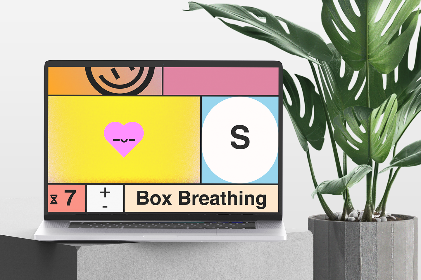
I used the logo shape in all the design materials—posters, magazines, even imagined billboards. And I think it worked well. The shape is strong and recognizable. Even without the brand name, I believe it still stands out and tells the brand story on its own.
Highlight & Thought
Designing for a high-end brand with a target audience I wasn’t part of had its pros and cons. I don’t personally follow skincare trends, so I brought in a different point of view, which helped the brand feel fresh. But on the downside, I might have missed some emotional or cultural connections that the target audience expects. For example, the lemon color I saw as natural might also remind people of chemicals depending on the shade. That’s something I need to study more. Maybe I rushed some decisions in trying to make the brand stand out—but overall, I’m really happy with this project.