The Project in depth
Brief
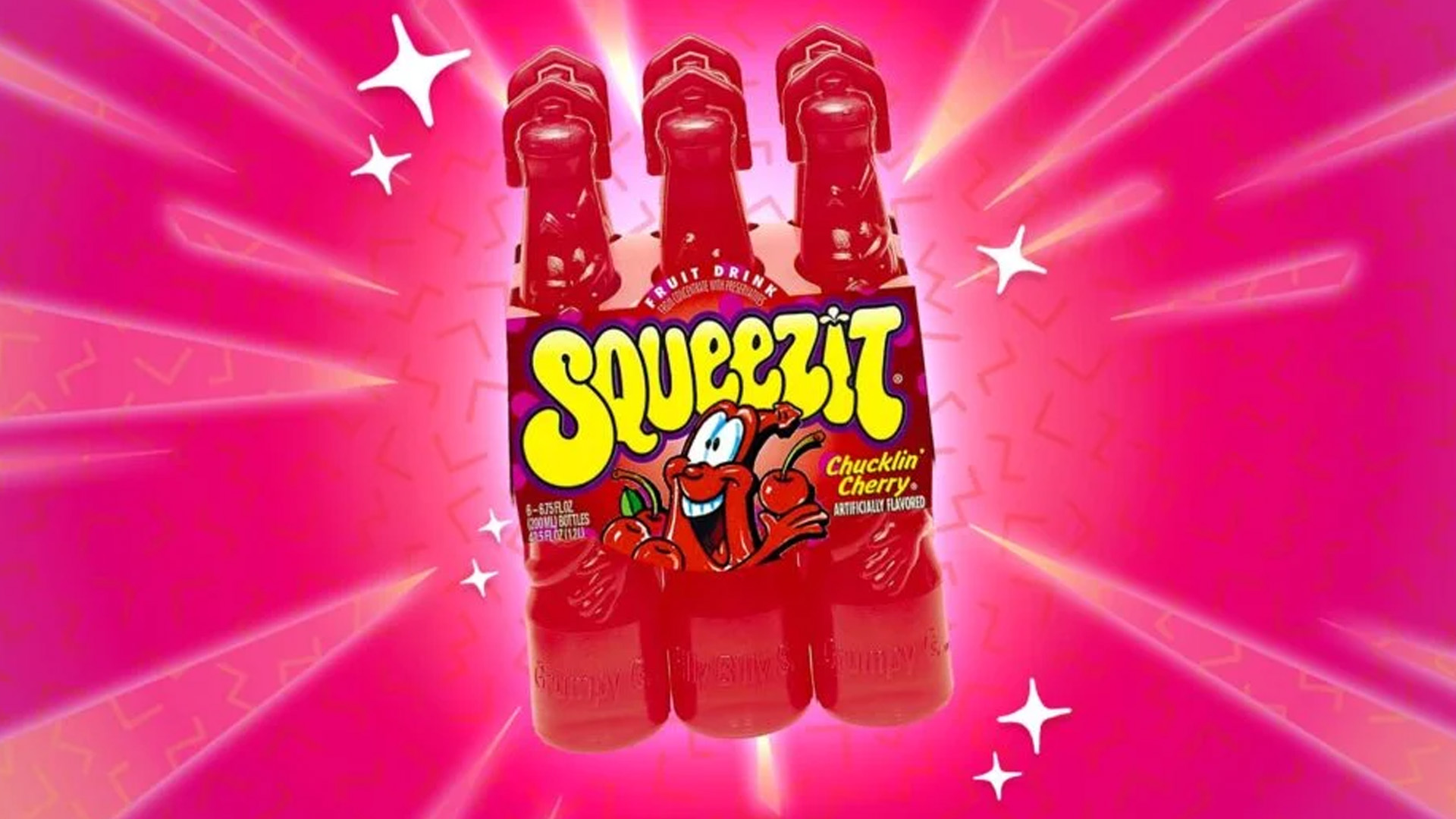
Rebranded a popular 90s fruit juice to make it modern and eye-catching for a new generation. The goal was to refresh its image while keeping the nostalgic feeling for those who grew up with it. I also made a promo video and a website for the brand.
Audiences & Users
The target audience includes nostalgic adults and young people looking for new juice options. It was made for both older fans who remember the drink and new customers who are just discovering it.
Challenge
This was my first time designing a commercial-style website during school. The original product was already very famous and had a strong character, so redesigning it was extra challenging. Since the juice is for kids, it was important to balance the fun and playful vibe of the old brand with a fresh, modern look that can attract both old and new fans.
Directions
In the past, the brand used a lot of animation for ads. But we had some limitations and couldn’t do the same. So I focused on one strong feature—the characters—and especially just the “eyes.” I matched the eyes with six different flavors. I kept the design colorful and fun to keep the original SQUEEZIT spirit.
Process
Early Stage
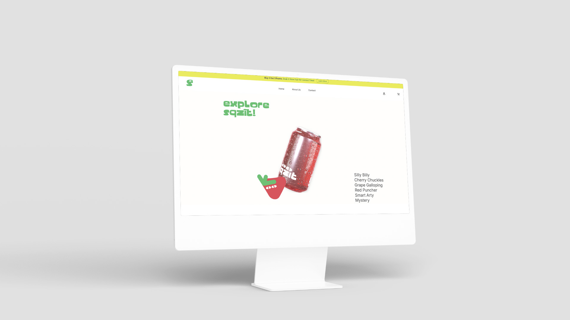
We started by researching how to make the brand look modern. One key change was shortening the name from “SQUEEZIT” to “SQZIT” to make it look more visually interesting. We also changed the packaging from plastic to cans, but kept the can transparent to show the drink color inside—this helps it stand out on store shelves.
Middle Stage
My duo, Keith Lie Richard, created all the 3D and motion work. One hard part was simulating the juice inside the can for the video. Instead of moving liquid, we used water droplets on the outside of the can to trick the eye. We designed six flavors with six bright can colors.
Final Stage
After finishing the key visual, I started building the website. It needed to tell the brand story and also be ready to sell products. I didn’t use JavaScript at this stage because I was still learning. Everything was done using only HTML and CSS—even dropdowns and lightboxes.
Highlight & Thought
From this project, I realized how important JavaScript is. Without it, I had to use complex CSS solutions that could have been much simpler with JS. For example, repeating components would be easier with loops. Also, from my instructor’s feedback, I learned that even small details—like making a logo move a little—can add a lot of value and make the design more interesting. It’s something designers should care about and spend time on.